CCS Bard Hessel Museum Interior
Annandale-on-Hudson, New York, USA
In 1990, Goettsch Partners and Nada Andric were asked to design a new building at Bard College that would house the newly created graduate school for curatorial studies, which came to be known as the Center for Curatorial Studies (CCS). The programmatic requirements for the building were as follows: provide large, flexible galleries to exhibit art from the Marieluise Hessel Collection; make galleries available to visiting curators who would organize and install exhibitions of contemporary art for five months of the year; accommodate graduate students who would be installing their own exhibitions in the remaining months. The building was to include a large storage facility to hold the permanent Hessel Collection, making it available to students for research and exhibitions. In addition, the building was to have a library, space for archives, seminar rooms, faculty and scholars’ offices, and a small cafeteria. Construction was completed and the building was occupied in 1992.
In 2001, the
architects were called upon to expand the existing facilities, as the library,
archival holdings and student facilities had outgrown their space. The goal was to design 10,000 square feet of
additional galleries to be used exclusively to exhibit work from the Marieluise
Hessel Collection. The new galleries
will be known as the Hessel
Museum and will be
connected to the original building with a large new entry and reception area. A
new physical plant that will service the entire facility is located below
grade, adjacent to the collection-storage facility.
For the Hessel Museum,
Goettsch Partners and Nada Andric worked in close association with Marieluise
Hessel and curatorial consultant Allan Schwartzman to design a variety of
gallery spaces uniquely suited to exhibiting the 1,780 diverse works of art
included in the Hessel Collection.
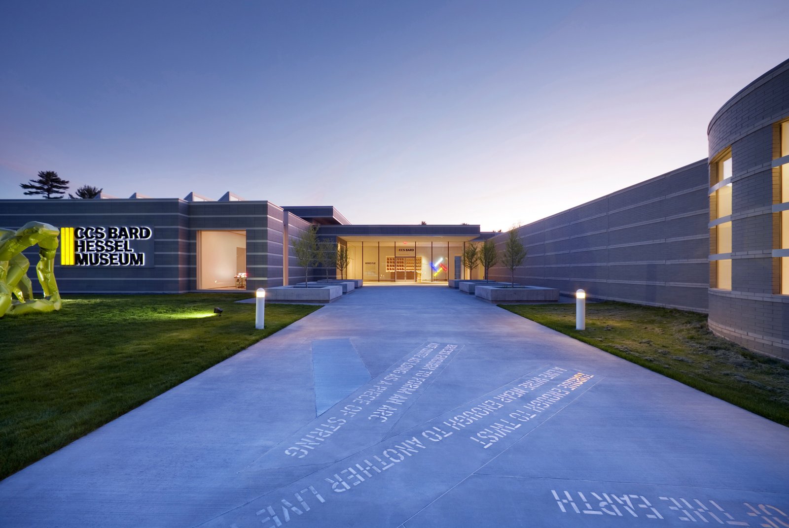
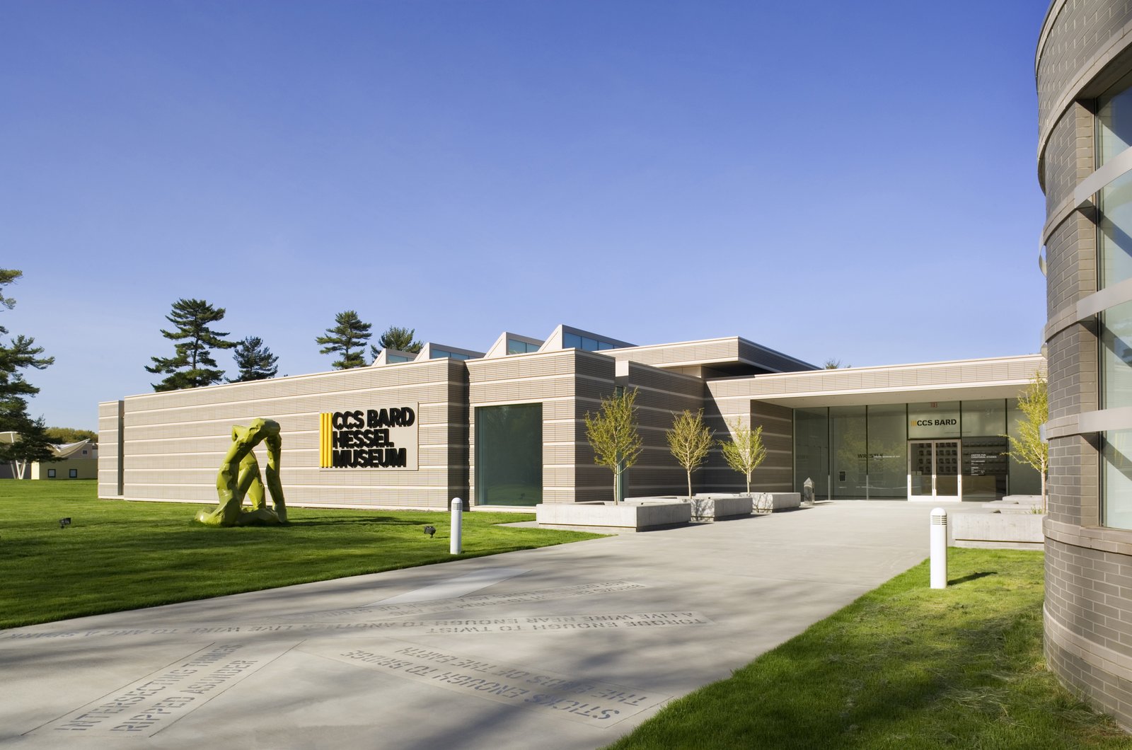
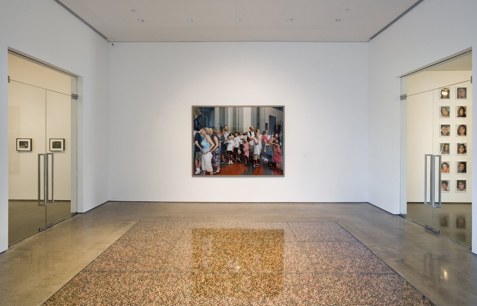
The art experience begins as the new entry is approached via a broad concrete sidewalk with a stainless steel Lawrence Weiner floor sculpture, a site-specific work that was commissioned by Marieluise Hessel for the 2006 addition. A small plaza provided in front of the building welcomes the whole Bard community, with large benches that also serve as containers for six ginkgo trees.
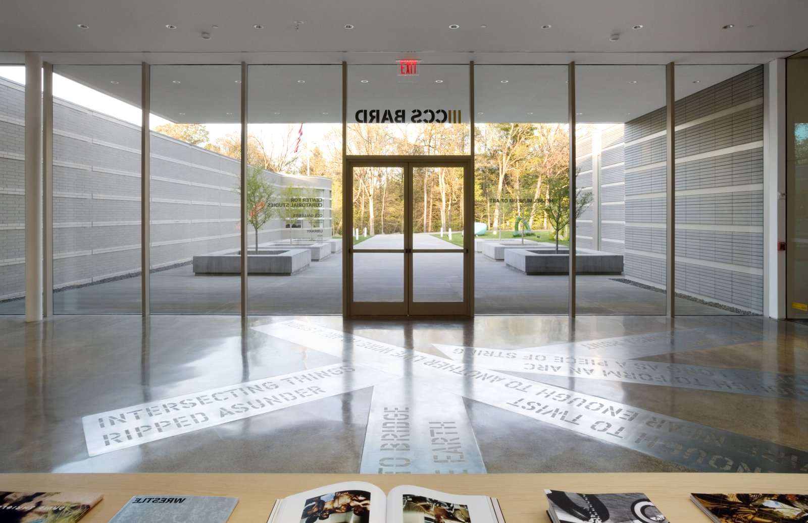
Entering the
building through a 14-foot-high, 50-foot-long glass wall, visual continuity
between interior and exterior is maintained and reinforced by the concrete
paving that flows from outside into the new reception area with another
component of the stainless steel Lawrence Weiner work embedded in the
floor. The reception area is scaled to
accommodate a variety of functions--as a reception/information area with a
small bookstore, a café with tables and chairs, an area with interactive media
to provide information about the Hessel Collection, a gathering place for
pre-function receptions, and most importantly, as a pivot point from which you
enter the existing building to the right and the new Hessel Museum to the left.
The Hessel Museum
visitors are greeted by another commissioned work of art, also embedded in the
floor, by artist Do-Ho Suh. The
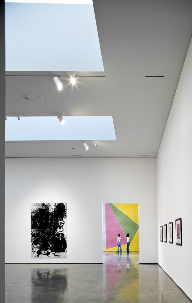
subsequent gallery circulation is organized in a manner that is similar to a
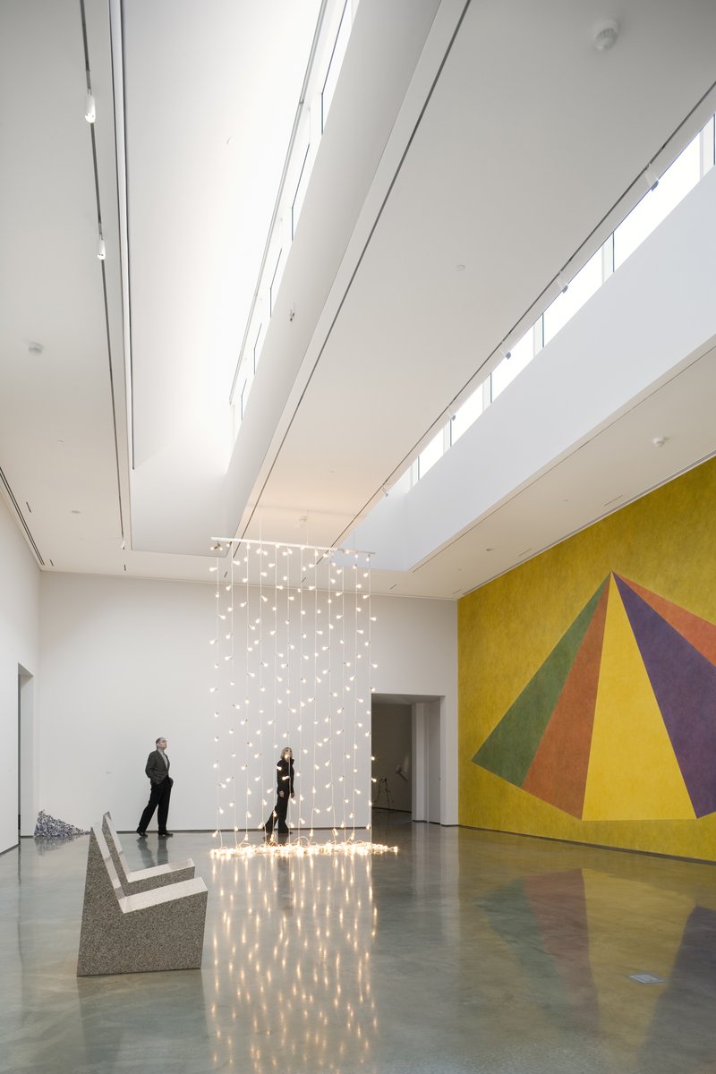
Palladian villa with an enfilade of rooms that surround two large 20- by
40-foot, 18-foot-high galleries with four long north-facing clerestory
windows. The galleries surrounding the
big rooms vary in size and ceiling height—some with daylight, some without and
some suitable for video installations.
The overall objective is to provide a variety of exhibition alternatives
to showcase the rich diversity of the Hessel Collection. Special consideration was given to the
circulation path through the museum. As
visitors pass from room to room, the passageways alternate, allowing the
specific type of artwork in each gallery to be highlighted.
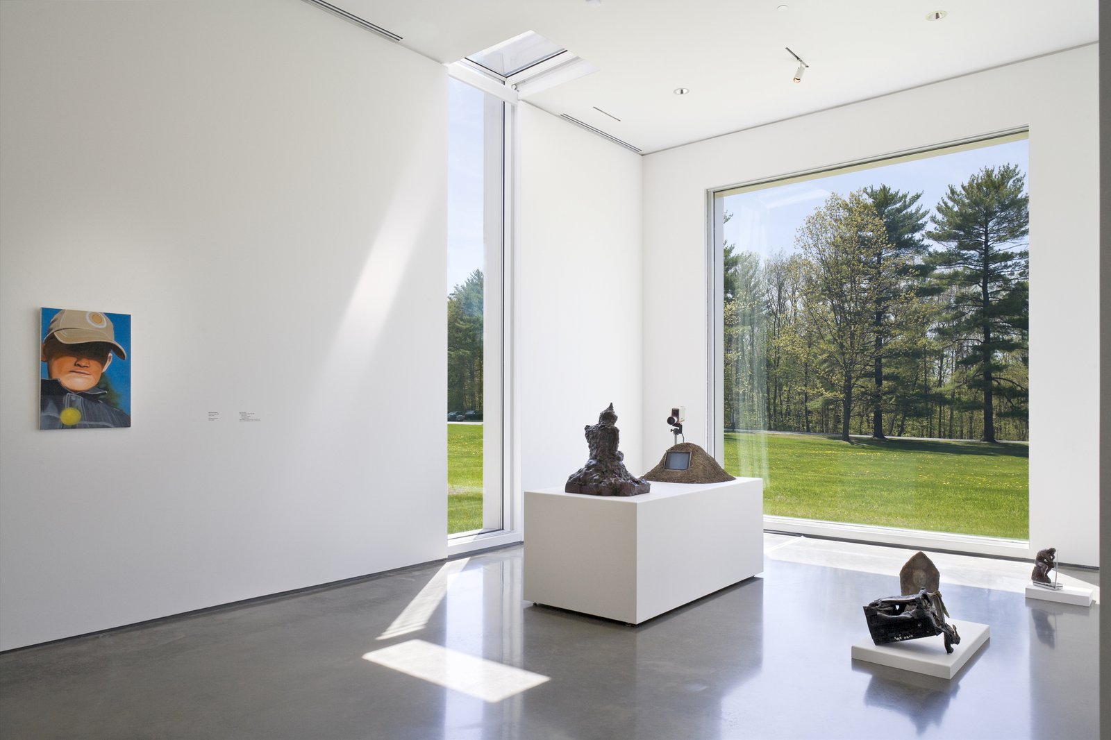
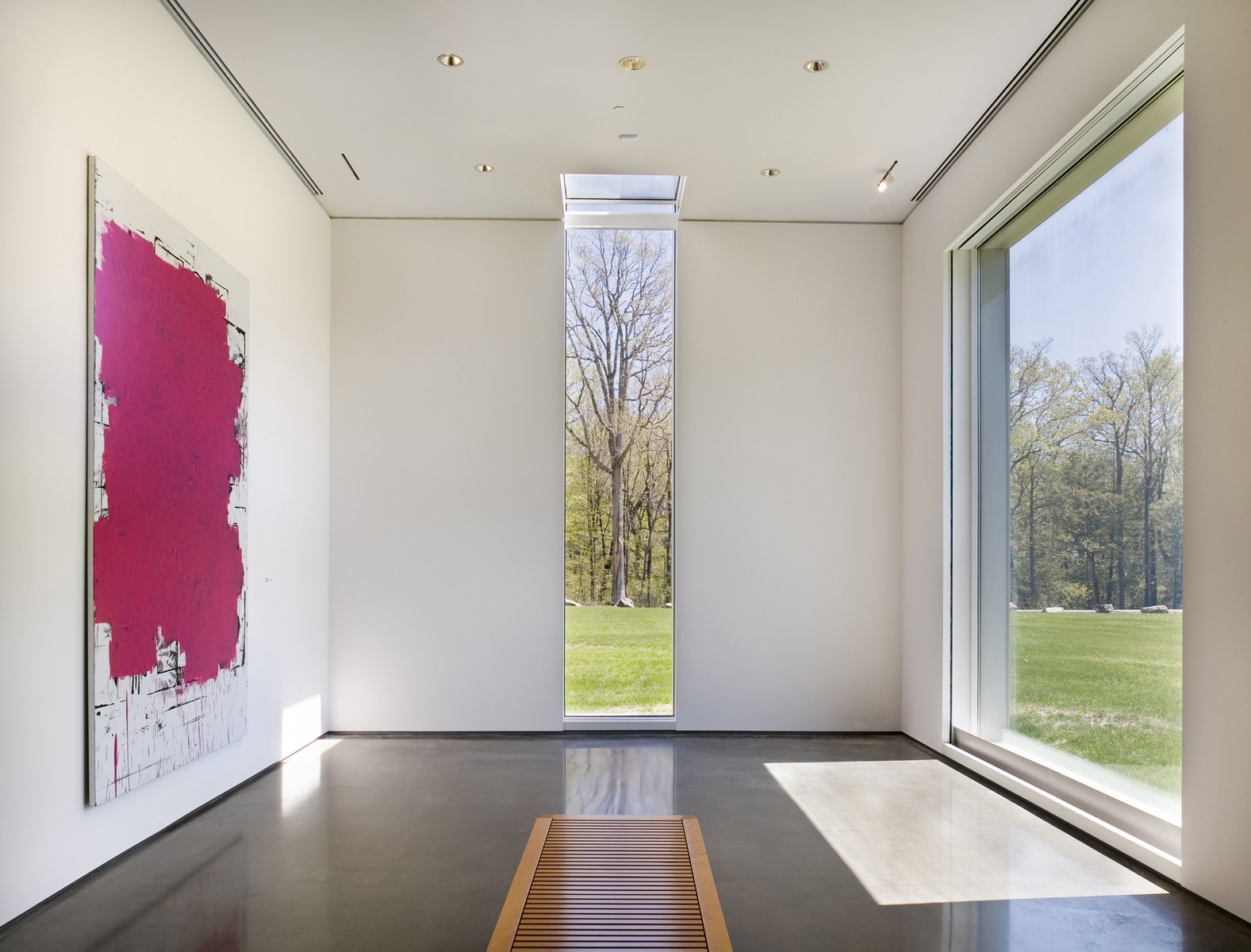
To avoid an
endless "white box" experience, daylighting is introduced at each of
the four corners of the museum. In
addition to providing the opportunity to exhibit certain works that benefit
from daylight, the windows provide the opportunity to reconnect with the
beautiful natural environment that surrounds the museum.
The
project’s construction details emphasize the minimal. Floors throughout are natural-ground concrete
with a slight bluish tint due to local bluestone aggregate that is a natural
ingredient in local concrete mixes.
Walls are painted white to match the existing galleries, with minimal
shadow reveals at the floor and the ceiling.
A consistent approach to artificial illumination via built-in,
adjustable track lighting provides optimal lighting levels at any point on the
gallery floors or walls depending on the artwork exhibited.
Although interior design of the Hessel Museum galleries was determined by the nature of the Marieluise Hessel Collection, special consideration was given to the exterior architectural form to ensure that it is compatible with the original building: The scale of the original vaulted galleries relates to the new large galleries with their north-facing clerestory windows; an overhanging entry roof ties the two buildings together in a unified composition; and cladding for the new Hessel Museum is a technologically advanced terra cotta similar in color and texture to the clay-coated brick of the original building.
